The first A/B test on a typical Shopify store targets button colours. Green versus blue, maybe rounded corners versus square. Those tests rarely shift revenue because they’re changing cosmetics whilst structural problems on the page go untouched. The checkout might have too many steps, or trust signals might sit so far from the price that shoppers abandon before seeing them.
A/B testing on Shopify gets interesting when it moves past the surface and into those structural questions. Building testing programmes for Shopify shops over the years has shown me that the experiments worth running are almost never the photogenic ones. A button swap might produce a 139% lift in one specific context, but the compounding gains come from methodical tests on the pages where customers actually get stuck.
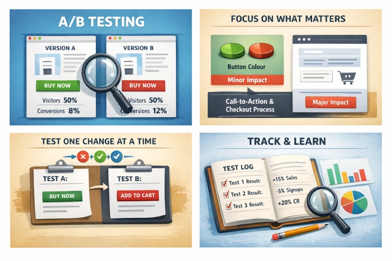
What A/B Testing Actually Involves
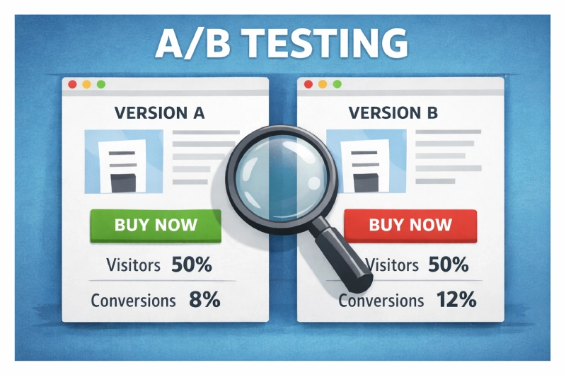
Dead simple concept. Send half your traffic to version A of a page and the other half to version B, then measure which version produces more of whatever you’re tracking. Purchases, add-to-baskets, email signups. The tool handles the split; your job is deciding what to change and whether the result means anything.
That second part trips people up. A test showing 12 conversions from 100 visitors on one version versus 9 from 100 on the other hasn’t proven a thing. The sample is too thin. Most tools flag results at 95% statistical confidence, meaning there’s only a 5% chance the difference is random noise rather than a genuine effect of your change.
Below that threshold, you’re guessing with extra steps.
Shops running structured testing programmes consistently outperform those relying on gut feeling, with one cross-industry study finding 48% higher conversion rates among systematic testers. Random tests produce random lessons, whilst structured ones compound.
Where To Start Testing on a Shopify Store
Not every page element is worth your testing time. Some changes produce measurable revenue shifts within a fortnight, whilst others need six months of traffic before you’d spot a difference.
Add-to-Cart and Buy Buttons
CTAs sit at the exact point where browsing becomes buying. Everything else on the page exists to get someone to that button, so even a modest improvement feeds directly into revenue. Andreas Carter Sports tested switching their add-to-basket button colour and saw a 50% reduction in cart abandonment. One change, properly tested, halved their drop-off.
It wasn’t hidden or broken. It just didn’t contrast enough with the page background for shoppers to spot it quickly on mobile.
Colour gets the headlines, but button copy often produces larger differences. First-person phrasing (‘Add to my basket’) versus second-person (‘Add to your basket’) converts differently depending on the product category.
Position matters too: higher-priced items sometimes perform better when the CTA sits after detailed product information rather than above the fold, because the customer needs to build confidence before committing.
In Shopify’s theme editor, you can adjust button placement per template without touching Liquid code if you’re using Dawn or any OS 2.0 theme. Worth knowing, because cheaper impulse buys want the opposite approach: minimal distance between interest and checkout.
Product Page Layout
Review placement influences purchasing behaviour more than most shop owners expect. Displaying star ratings near the price can lift confidence, but the format matters as much as the position.
Star ratings versus numerical scores, visible review counts versus hidden ones, even whether you surface negative reviews prominently or bury them. Each produces measurably different outcomes, and Shopify apps like Judge.me and Loox let you experiment with review display formats without touching your product template code.
My preference is to test description length before copy style, because it typically produces larger conversion differences. A Shopify store selling technical outdoor gear might need 400 words of specification detail below the fold to satisfy buyers who research thoroughly. A fashion retailer in the Northern Quarter selling £30 tops probably converts better with three punchy sentences and larger lifestyle photography.
That gap can easily be worth a full percentage point of conversion.
Checkout Flow
Cart abandonment is the single largest conversion leak for most Shopify stores, and a proper ecommerce CRO framework treats checkout as its own testing category. Product page tweaks typically lift conversion rates by 12-28%, but checkout improvements often match that because they target people who’ve already decided to buy. Shopify’s checkout was historically locked down, but the extensibility API now opens up tests that previously required Plus.
High-impact checkout tests:
| Element | What to Test | Typical Impact |
|---|---|---|
| Progress indicators | Numbered steps vs progress bar vs none | 11-25% completion improvement |
| Payment options | Show all methods upfront vs reveal on selection | 8-19% completion improvement |
| Guest checkout | Prominent vs hidden vs forced account creation | Significant first-time buyer impact |
| Free delivery threshold | Different minimum spend amounts | 15-23% abandonment reduction |
Single-page versus multi-step checkout is worth testing too. Younger shoppers used to one-tap purchasing tend to prefer condensed flows, whilst older customers sometimes find a single page overwhelming and respond better to separated steps where delivery details and payment happen on distinct screens.
Promotions and Pricing Display
Percentage discounts and pound-off promotions perform differently depending on your price point. A ‘20% off’ label tends to pull harder on items under £50, whilst ‘£15 off’ converts better on higher-priced products where the absolute saving looks more impressive. The crossover point sits somewhere around £75 for most Shopify stores I’ve worked on, though it varies by category.
Testing your free delivery threshold is one of the quickest wins for average order value. Set it too low and you’re giving away margin; set it too high and shoppers abandon rather than spend up. Our guide on urgency and scarcity covers the psychology behind countdown timers and stock indicators, both worth testing if you sell products with genuine limited availability.
Picking the Right Testing Tool
Your traffic volume dictates which tier of tool makes sense. A Shopify store doing 10,000 sessions a month can get started on a free plan, but a Plus merchant pushing half a million monthly visitors needs proper statistical modelling and native Shopify integration.
| Tool | Suited To | Starting From | Shopify Integration |
|---|---|---|---|
| VWO | Shops new to testing | Free starter plan | Snippet install via theme.liquid |
| Convert | Growing Shopify stores | ~£250/month | Native Shopify app with revenue tracking |
| Crazy Egg | Visual-first teams | ~£80/month | Script tag install, heatmaps on any page |
| Optimizely | Shopify Plus merchants | ~£30,000/year | Full SDK with checkout testing on Plus |
| AB Tasty | Personalisation-heavy stores | Custom pricing | Shopify app with audience segmentation |
| Kameleoon | Cross-platform retailers | Custom pricing | Server-side option for headless Shopify |
VWO‘s starter plan is where I’d point most Shopify store owners who haven’t tested before. The visual editor lets you create variations by clicking and editing page elements directly, so you’re not waiting on a developer every time you want to try a different button position. Built-in heatmaps and session recordings then give you context for why a test won or lost, which is cracking for building your next hypothesis.
Larger operations with dedicated CRO teams tend to land on Optimizely or AB Tasty. Optimizely’s Bayesian stats engine can reach significance from smaller samples, which matters when you’re running multiple experiments simultaneously. The annual contract and ~£30k price tag make it impractical for shops doing under 100,000 monthly sessions, though.
How To Run Tests That Produce Reliable Results
Discipline separates a testing programme that compounds knowledge from one that wastes time. Microsoft Bing discovered a single A/B test worth $100 million in annual US revenue. That didn’t happen by accident. It happened because they test thousands of changes per year with a structured process behind each one.
Start With a Problem, Not a Guess
Before changing anything, look at where customers are actually struggling. Google Analytics 4’s funnel exploration report shows you exactly where visitors drop off between landing and purchase.
Session recordings in tools like Hotjar or VWO reveal the specific friction points. People hunting for the size chart. Scrolling past the add-to-basket button on mobile. Giving up at the delivery options screen because the postage costs weren’t visible until that point.
Those observations become hypotheses. ‘Customers can’t find the size chart on mobile, so moving it above the fold should reduce product page exits’ is a proper hypothesis. ‘Green buttons might convert better than blue’ is a guess.
Give Tests Enough Time and Traffic
Small samples produce unreliable results. Full stop. Use a sample size calculator before launching any test so you know how many visitors you need before the result means anything. Most Shopify stores need at least two full weeks of data, capturing both weekday and weekend shopping patterns.
A test running only during a promotional period doesn’t reflect normal performance. Black Friday shoppers behave differently from January browsers, and weekend visitors often carry different purchase intent than weekday traffic. Capture at least two complete business cycles before drawing conclusions.
Test One Variable Per Experiment
Changing the button colour and position while also rewriting the copy in a single test tells you one of your changes mattered, but not which one. That’s a wasted experiment.
Sequential A/B tests isolating individual variables take longer to run but produce lessons you can actually build on. Change the button text alone and conversions climb, you know the text mattered, but change three things at once and you’ve learned almost nothing reusable.
Mobile Needs Its Own Experiments
A checkout flow that works brilliantly on a 27-inch monitor can be a right pain on a phone. Touch targets are smaller and scrolling behaviour changes entirely. Mobile shoppers are also more likely to be distracted mid-purchase, so research suggesting 89% of successful testing programmes build mobile-specific variations is no surprise.
In Shopify, preview your variations on actual devices through the theme customiser’s mobile view before going live. Browser responsive mode is a poor proxy for how Shopify renders dynamic sections on a real handset.
Record Everything
The most valuable outcome of a testing programme isn’t any single winning variation. It’s the accumulated understanding of what your specific customers respond to.
A spreadsheet logging each test alongside the hypothesis behind it and the outcome is worth more than any single winner. It stops your team re-testing ideas that already failed and builds a picture of your customers’ preferences over time.
Track your ecommerce KPIs alongside each experiment so you can spot whether individual test wins are translating into broader revenue improvements or just shuffling conversions between pages.
Building a Testing Programme That Compounds
Shopify stores with the strongest conversion rates aren’t running the cleverest experiments. They’re treating testing as an ongoing discipline rather than a one-off project.
Start with your highest-traffic pages and your most direct revenue levers. For most Shopify shops, that means:
- Add-to-basket buttons on your top 10 product pages by traffic
- Checkout flow from cart through to order confirmation
- Free delivery threshold and how prominently it’s displayed
- Product description length on your highest-revenue categories
A single winning test on a page pulling 20,000 monthly visits generates enough evidence and enough revenue to justify expanding the programme.
Set up proper conversion tracking before your first experiment so the data feeds cleanly into GA4 and your testing tool. Without that foundation, even a winning test leaves you arguing about whether the numbers are real.
For Shopify stores that reckon they’d benefit from structured experimentation but lack the capacity to run it in-house, our Shopify SEO service includes CRO analysis and testing recommendations built around your traffic patterns and conversion data. A/B testing done properly on Shopify is less about chasing viral case studies and more about stacking small, evidence-backed gains until your conversion rate is unrecognisable from where it started.
