
Knowledge Hub
What An Ecommerce Landing Page Needs And Which Page Each Visitor Should Land On
By John Butterworth · September 29, 2026
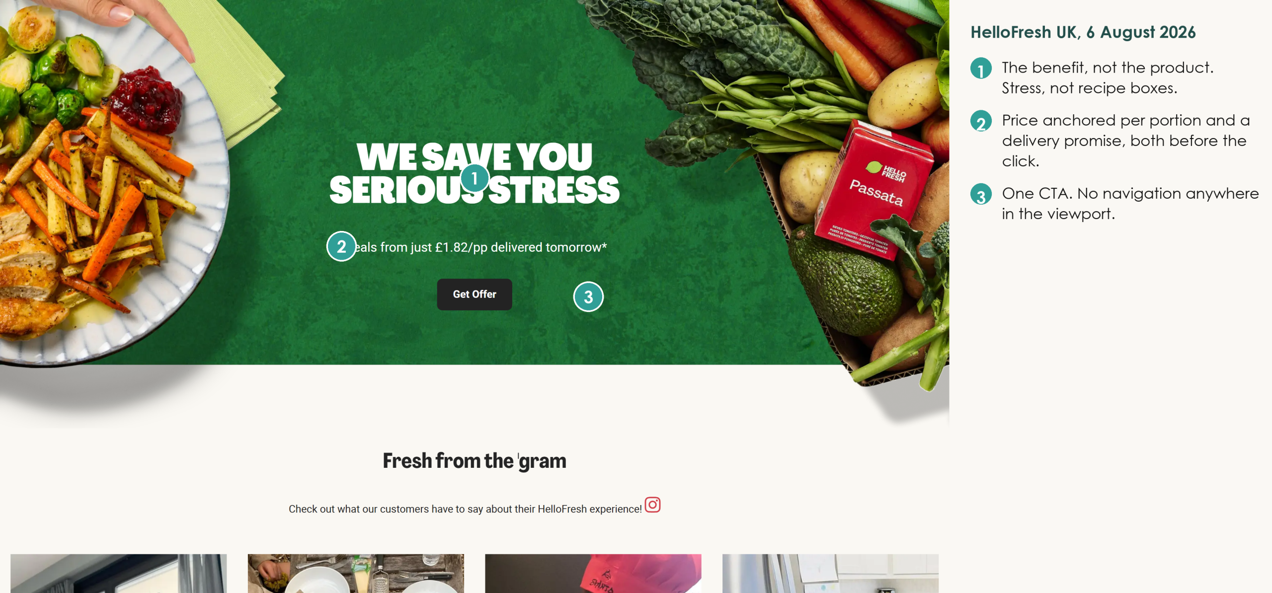
An ecommerce landing page is the page a shopper lands on after clicking an ad, an email or a Google result, built so that one visit ends in one order. What goes on it follows from where that shopper came from and what they were promised before they clicked. Tap an ad for a mattress sale, and you need the discount with a button in front of you; search for opaque tights, and you need to see tights.
Checking those pages is the first job I do when a store comes to Mint SEO for ecommerce SEO services with ads that bring clicks and no orders. That job falls to me, John Butterworth, at our office in Manchester. Straight after the ad pages I check the collections, because Google picks those as landing pages for you.
Put The Offer, One Button And The Proof In The First Screen
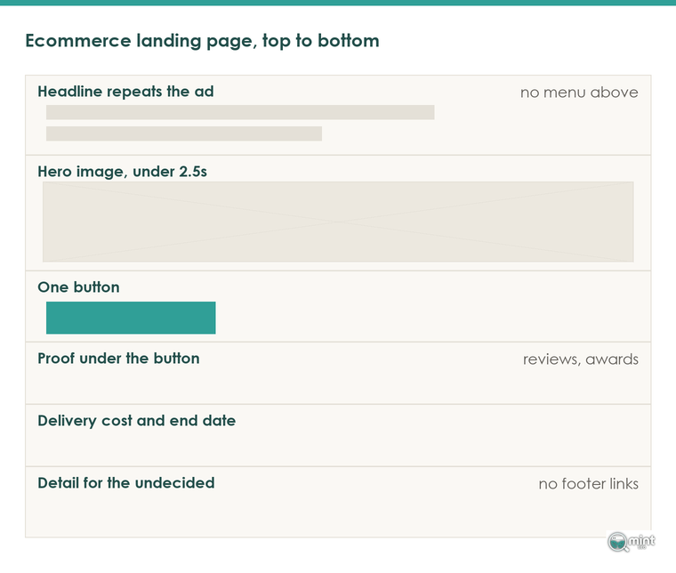
A high-converting ecommerce landing page runs in a set order. A headline repeats the promise, one call to action button follows it, and proof sits under that button. Below them come the delivery cost and the deadline, then detail for anyone still deciding.
On a phone, everything a shopper needs to say yes sits in the first screen. That includes the proof: a review count, a rating or a named award, picked the way our guide to which social proof to show sets out.
On a page built for paid traffic, take the navigation menu and footer links off, and switch off the newsletter pop-up there too. Each one lets a shopper leave before the button, and you've already paid for that click.
The Headline Repeats What The Ad Or Email Promised
Write the landing page headline from the ad or email that links to it. If the ad says opaque tights that stay up, the headline says opaque tights that stay up, in the same words.
A store's homepage is the page I see fail this test most often, because its headline is usually a brand line. A shopper from an ad then has to open a product to find out what the store sells, and paid visitors rarely bother.
I see the same waste when the homepage grid leads with a free download, which sends the paid click to the one product that earns nothing.
Delivery Cost And A Real End Date Sit Above The Button
Extra charges that only appear at checkout are the most common reason shoppers abandon an order. Put the delivery cost and the returns window next to the button, because that's where the shopper hesitates and a policy page two clicks away does nothing for them.
A sale landing page also needs a reason to buy today, so print the end of the offer as a date and a time beside the price. Without one, a shopper who likes the price bookmarks the page and leaves.
A discount and a deadline are different levers, and the discount only moves the price. That's why I'm a fan of real deadlines, and our guide to urgency that stays within UK consumer law covers the claims you can make.
A Hero Image Slower Than 2.5 Seconds Loses The Paid Click
A hero image is usually the largest thing in the first screen, so it sets Largest Contentful Paint, the measure of when the main content appears. Google's guidance on Largest Contentful Paint at web.dev puts the line for a good experience at 2.5 seconds or less.
Phones make this worse, because most paid traffic from social ads lands on a phone over a mobile connection.
Use one hero image sized for a phone screen and compress it. Leave out the slideshow and the autoplay video behind the headline.
I treat landing page speed as a sales problem first, because a slow page loses orders straight away and the ranking effect is small. If the whole store is slow, speed up your Shopify store before you build more pages on top of it.
Send Each Traffic Source To The Page Built For It
Whether you need a separate landing page depends on where the traffic comes from. An email subscriber already knows your brand and has bought before. A visitor from paid search may never have heard of you, so the two have a different conversion rate and need different pages.
A Mattress Sale Ad Lands On Proof And A 200-Night Trial
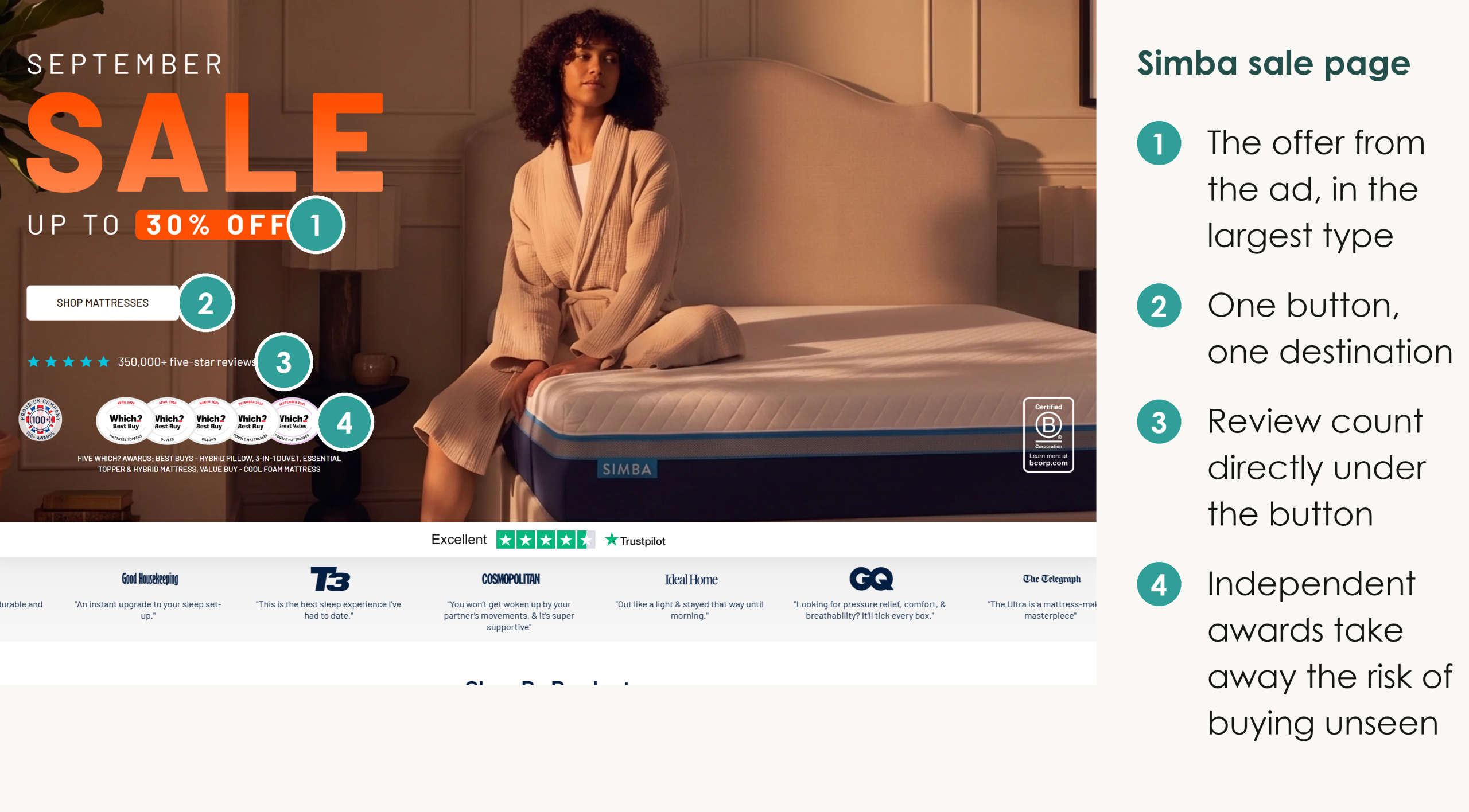
A mattress is expensive and bought without lying on it, so the page a sale ad lands on has to take that risk away before the scroll. This September, Simba's sale page shows 'up to 30% off' and one Shop Mattresses button, with 350,000+ five-star reviews directly under the button and five Which? awards beside it. Further down it offers a 200-night risk-free trial.
For a big-ticket product that trial is the proof that matters most, and I'd move it up into the first screen next to the discount.
Email Subscribers Land On A Permanent Offers Page
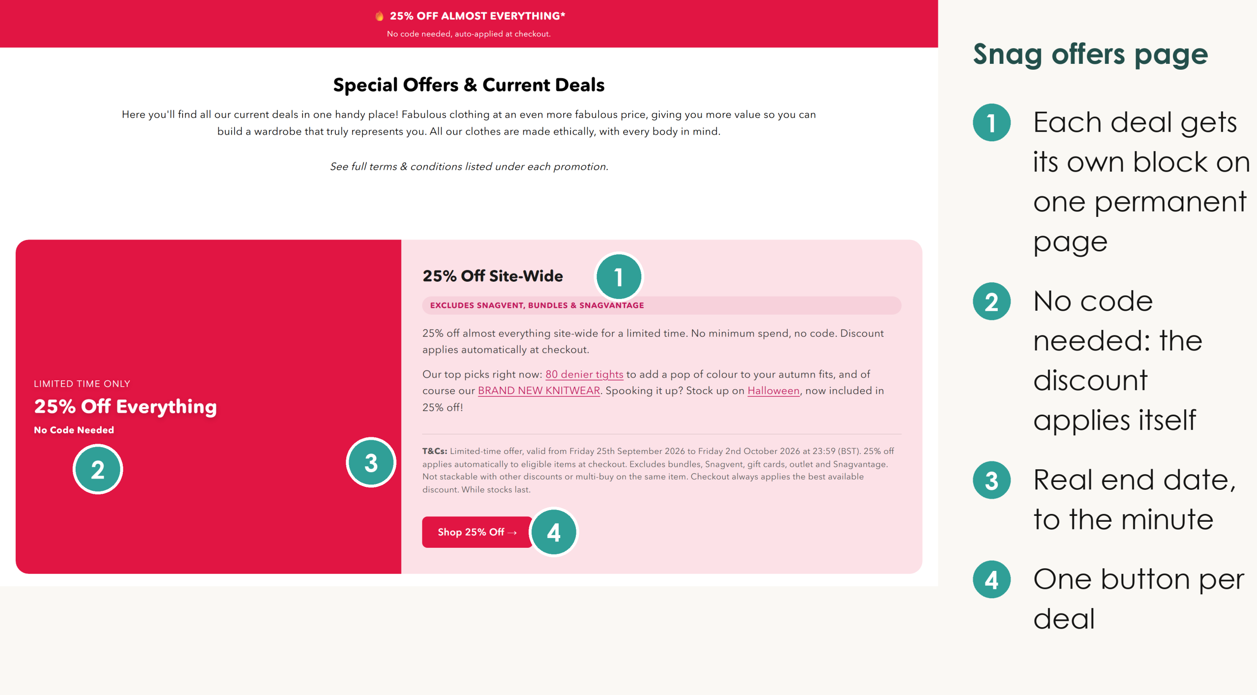
Snag is a UK tights brand that keeps every live deal at one address. On its special offers page each deal carries its own dated terms, such as 25% off almost everything from 25th September to 2nd October 2026. There's no code to enter, and each deal has one Shop button.
One permanent URL means every email and the announcement bar point at a page that is always current. It also keeps the links it earns, where a new page for each campaign starts with no links and is deleted a week later.
Google Searchers Land On The Collection Page
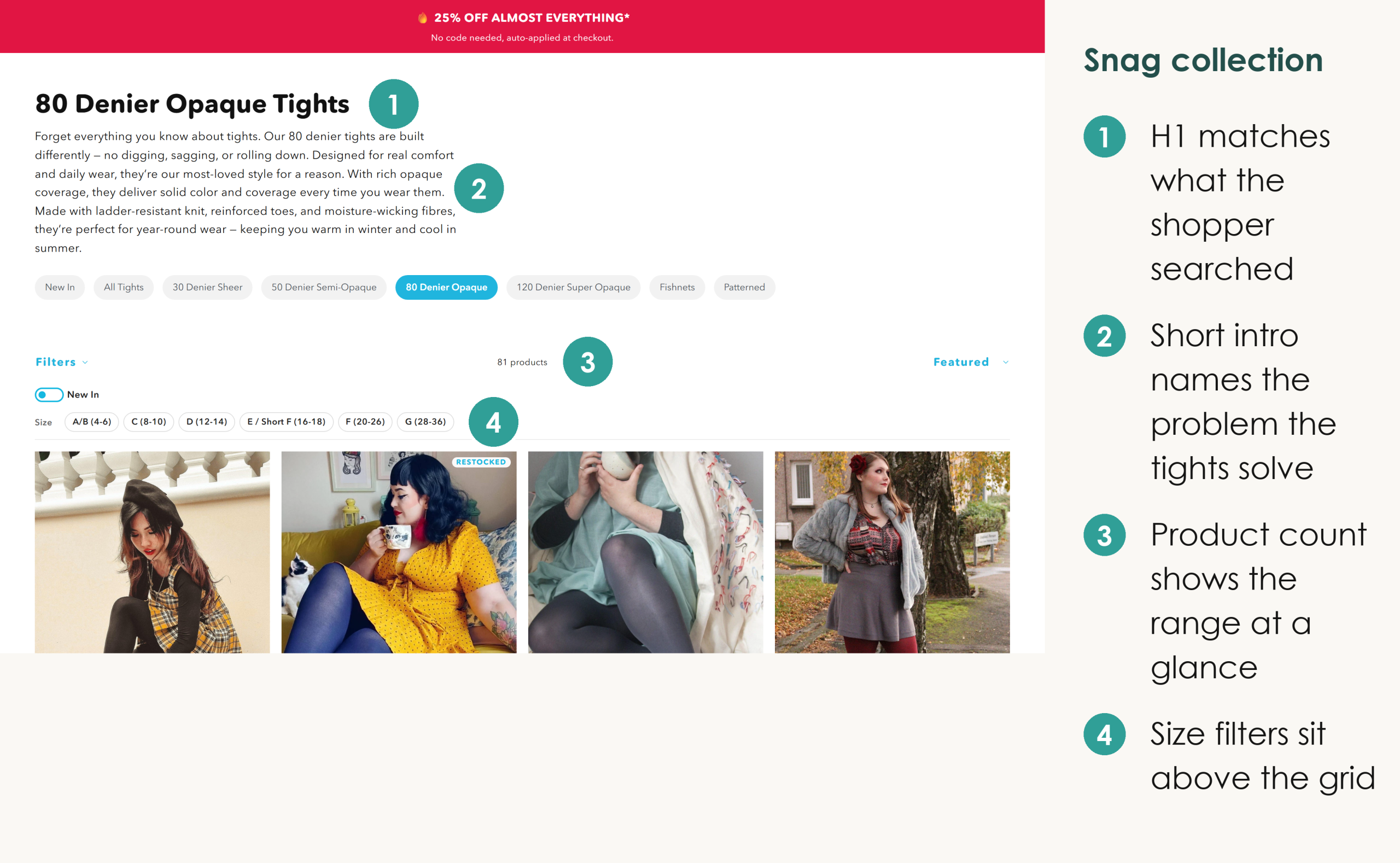
For search traffic, the collection is the landing page, because Google ranks it for the product type. Snag's 80 denier opaque tights collection is built for that job. Its H1 matches the search, and a short intro names the problem the tights solve: digging, sagging and rolling down.
Size filters sit above the product grid, so a shopper narrows the range to their size before scrolling.
The reviews and FAQ under the grid answer the fit question. That content beneath the grid also builds the page's relevance for the search, because reviews add text about the product that no other store has.
Snag puts nothing between the H1 and the intro, so a searcher who landed from Google reads what the collection sells before any widget loads. Keep your own collection intros in that position, and check that no app injects a banner above them. Our guide to collection page SEO covers the full method.
Decide Which Of Your Landing Pages Google Should Index
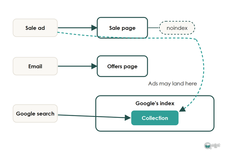
For a visitor from Google, the index decides which landing page they reach. A page with an end date is the kind I'd give a noindex tag, such as a sale-only collection like Snag's /collections/25-off-everything. Your collections meant to receive searchers stay indexed.
A noindex tag takes a page out of Google Search whatever links to it, while your ads and emails still reach it. Add it when the page goes live, because Google can take months to recrawl a page and drop it. Never block a landing page in robots.txt instead, as Google then can't read the noindex tag at all.
A Landing Page That Copies A Product Page Takes A Canonical
A landing page that repeats the content of a product page is a duplicate, and the fix is a canonical tag pointing at the product it copies.
Duplicate content carries no penalty; the cost is that links and signals split between two URLs. The canonical folds the copy's links into the product you want to rank, including clicks that come in with ad tracking parameters on the URL.
A noindex tag would remove the copy from Search and keep nothing. On Shopify, building the landing page as an alternate template of the product itself avoids the duplicate altogether, because both share one URL.
Google's Ads Can Now Send A Paid Click To Any Page On Your Store
For paid search, Google can now override the landing page you choose. Google Ads turns Final URL expansion on by default when you opt into AI Max. Google may then replace your chosen page with another page on your site it judges more relevant, and write a headline to match.
In practice, any collection can become the landing page for a paid click, so each one needs the same first screen as a page built for ads. The control Google gives you is URL exclusions in the campaign settings.
Add the pages that should never take ad traffic, such as a trade-only collection, and don't rely on noindex to keep ads away.
Build The Landing Page On Shopify With An Alternate Template
On Shopify, a landing page is an alternate template assigned to one page or product. Building it this way keeps page-builder apps and their scripts away from the page you're paying to send people to, where every extra script slows the first screen.
Step 4 works because Shopify's JSON template documentation lets a template name the layout it renders with.
Leaving the header out of the layout beats hiding it with CSS, because hidden code still loads.
Find Out Which Of Your Pages Are Ready To Take Traffic
Every page on your store is somebody's landing page, which is why our SEO audit looks at them early. It tells you which collections are ready to take search and ad traffic now, and what to fix first on the rest.
Get your SEO audit and see which of your ecommerce landing pages are ready.

About the author
John Butterworth
John Butterworth is the founder of Mint SEO, a Manchester ecommerce SEO agency he started in 2024. He has 11 years in SEO and digital marketing, previously running SEO departments for market-leading brands and several agencies. He specialises in Shopify and ecommerce SEO, and his work has ranked over 100 websites and driven more than 3 million organic visits. He speaks at industry events including the SEO Mastery Summit.
Connect on LinkedIn →