
Knowledge Hub
The Six Mobile Changes That Move Ecommerce Revenue First
By John Butterworth · August 16, 2026
Phones bring you most of your sessions and a fraction of your orders.
Store owners send me that number most weeks, attached to a request for mobile ecommerce best practices.
Those guides list roughly the same nine. None of them tells you which one to do on Monday morning.
My name is John Butterworth and I have run SEO for eleven years, these days from Mint SEO in Manchester.
Across the ecommerce stores on our books, a product page on a phone is the first thing I open, because that one page decides more revenue than the rest of the site together.
So what follows is a ranking. Six changes, in the order I would make them on a store I had inherited last week, with what each is worth and how to tell whether yours needs it.
The six mobile changes worth your quarter, ranked
Three things decide the order, and you should know them before accepting mine.
The first of these is what a change does to the buying moment. A change that removes a step between deciding and paying outranks one that makes a page nicer to look at.
Evidence comes next on that list. Some of these carry a measured result and some carry only agreement, and agreement is worth less.
Third is what it costs to ship. A theme setting you can switch on this afternoon beats a rebuild you will still be arguing about in October.
With those three stated, judge the order against your own catalogue.
A store selling one product at forty pounds has a different bottleneck to a furniture brand whose product pages run for screen after screen of comparison content.
Keep the buy control on screen, and open the purchase step where the shopper is standing
This sits first because it has the clearest evidence behind it and the smallest build in front of it.
That evidence comes from conversion agency Growth Rock, which publishes the full results of its ecommerce tests, including the ones that lose. It ran three versions of a mobile product page against each other.
One had no sticky add to cart button at all. One had a sticky bar that scrolled the shopper back up to the add to cart area. One had a sticky button that slid the add to cart controls up from the bottom of the screen like a drawer.
Growth Rock reports the drawer version produced a 5.2% increase in orders at 98% statistical significance.
Growth Rock records fourteen days of testing with more than 3,000 orders per variation, so it is properly powered rather than a hopeful read. Add to cart clicks on the drawer version rose 11.8%.
But the third version is where the advice stops short. In the same test, the version that only scrolled the shopper back up showed no statistically significant difference in conversion rate from the original.
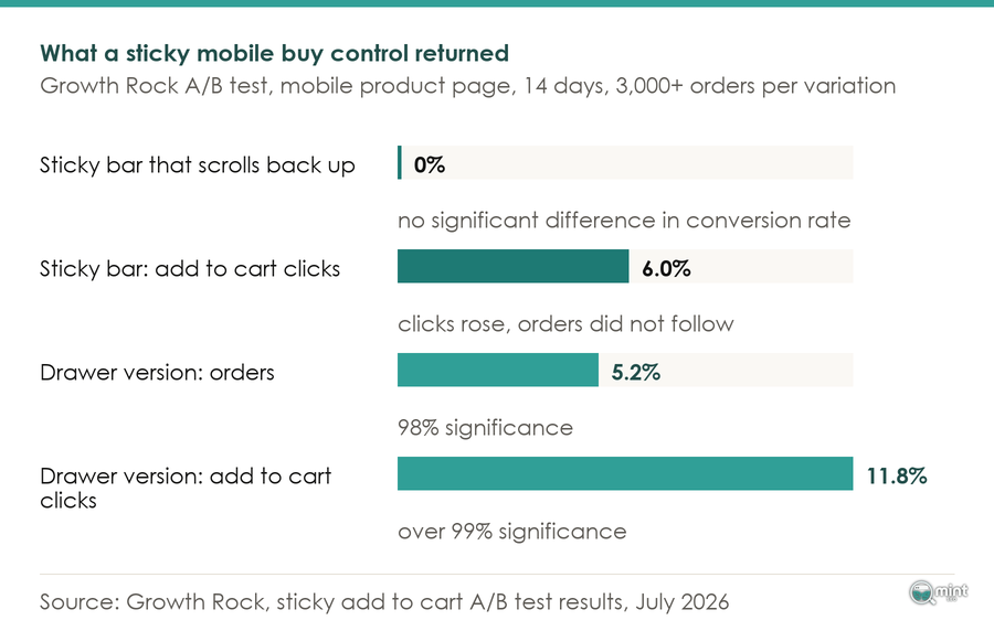
That distinction is the whole tip. A shopper decides to buy at the depth where reviews and detail sit. Sending them back to the top to find a button makes them re-find a decision they had already made.
Keeping price and button together at the bottom of the screen does something different. It opens the variant and quantity controls where they are standing.
Done properly it looks like the Fellow Products cold brew page, which runs past six phone screens with the buy control pinned to the bottom and the price beside it the whole way down.
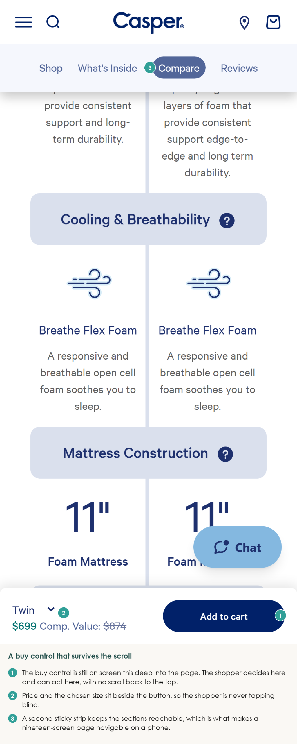
That same pattern holds on a far longer page at Casper.
Stop lazy-loading the one image your page is judged on
Page speed work on mobile usually starts in the wrong place. It should start with a single image. That image is identifiable. The HTTP Archive Web Almanac reports in its 2025 performance chapter that about 16% to 17% of pages lazy-load their Largest Contentful Paint image, a figure the Web Almanac notes has held steady since 2024.
The Web Almanac puts an image as the LCP element on 76% of mobile pages. For three quarters of phone pages the element being measured for speed is an image, and a sixth of the web delays that image deliberately. Here's the mechanism, and it's worth understanding. Lazy loading tells the browser to defer an image until it approaches the viewport.
Your hero image is already in the viewport. Deferring it buys nothing and costs the wait, which is how a page fails Core Web Vitals while every individual asset looks optimised.
It usually gets there by accident. Somebody switches on a blanket lazy-load rule, or installs an image optimisation app carrying one, and the setting does what it says across every image including the first.
Exclude the hero and the first product image from that rule. Everything below the fold can defer as intended, and our guide to speeding up a Shopify store covers the platform-level work around it.
Put express checkout in front of the form rather than after it
Typing is the specific thing a phone makes expensive.
A stored credential removes address and card entry entirely, which is why express checkout buttons belong above the first field.
Baymard Institute, which has more than 200,000 hours of UX research behind it, found in 2024 that the average checkout carries 11.3 form fields where eight would do. Every one of those fields is a keystroke a wallet button skips.
Move the wallet buttons above the form. Count what is left underneath them, because most surviving fields turn out to be optional.
Keep the survivors in a single column. Two-column form layouts on mobile force horizontal scrolling or zooming, which is the other reason a phone checkout stalls.
Mobile checkout deserves its own pass beyond this one change, and we walk the whole sequence in our guide to the ecommerce checkout process.
Reserve the space for every image so the layout stops moving under a thumb
Cart abandonment gets blamed on price far more often than on layout. Some of it is a button that moved.
The Web Almanac reports 62% of mobile pages failing to set dimensions on at least one image, down from 66% the year before. Without a declared width and height a browser can't reserve the box. Everything below the image jumps when it lands, and on a phone that jump happens under a thumb already moving toward a button.
Set explicit dimensions or an aspect ratio on every image template. Start with the gallery, where the largest images and the worst shifts live.
Move variant choice into the thumb zone and out of dropdowns
Variant selection is a separate friction from the button, and most themes handle it badly on a phone. One-handed, the thumb zone is the bottom of the screen. A native dropdown opens a picker covering the page your shopper was reading.
Swatch buttons placed low solve both problems together. Mobile shoppers can see the options without losing the product, and reach them without changing hands.
This one is only worth doing if your products have variants. Single-product stores should skip it and spend the time on the first two.
Clear the fonts and third-party hosts sitting in front of first paint
Two further numbers finish the ranking. The Web Almanac reports 87% of mobile pages loading at least one web font, and only 44% of mobile pages serving their LCP image from the same host as the document. Both cost a round trip before anything appears. A render-blocking font holds the text behind it, and an image on a second host needs a fresh connection opened before a single byte lands.
Self-host the two fonts you use, drop the rest, and serve the hero image from the same host as the page. This is last because it's the most work for the smallest movement, which is exactly why it shouldn't be first.
Which of the six your own store needs
A ranking is generic by construction and you have one store. You can place yours against it in an afternoon.
The five-minute version on your own phone
Open your own product page on a phone.
Scroll to where the reviews and the detail sit, which is where a real shopper decides, and write down what you find.
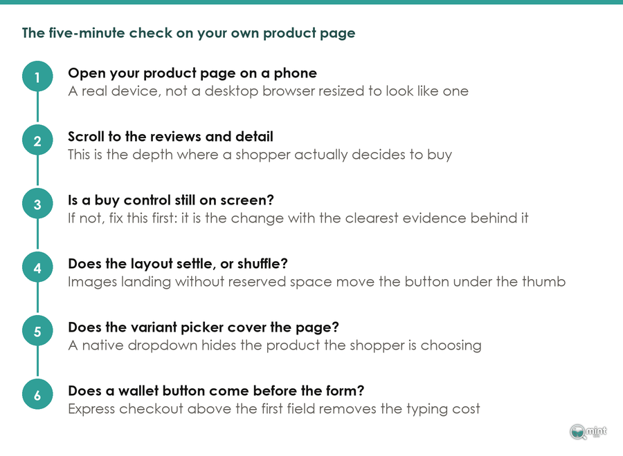
Four things are worth writing down. Is a buy control still on screen, and does the layout settle or shuffle as images arrive?
Two more follow. Does the variant picker cover the page, and does a wallet button appear before the address form?
You will not be in any doubt either way. Casper's mattress page runs to roughly nineteen phone screens and keeps a tappable buy control on screen throughout. Two stores go the other way.
Kettle & Fire runs past twenty screens and by that depth there is nothing to tap.
Gymshark loses its control inside the product detail too, on a store with no shortage of optimisation resource. A missing buy control on a store that size is a layout decision, since the budget is clearly there.
Responsive design gets you a page that fits. None of these four checks is about fitting.
The checkout number that separates your work from Shopify's
One caveat before you credit any of this work to yourself. Shopify's Spring 2026 Editions replaced the hosted checkout on 17th June, with a tighter layout, a more prominent pay button and less scrolling on mobile. It arrived automatically for every merchant on that hosted checkout. There was no opt-in, and there's no way to run the old version against the new one inside your own store.
Any mobile number that moved after that date needs isolating first.
Your overall conversion rate mixes traffic quality with checkout performance and won't separate them.
Checkout-to-purchase rate only moves once a shopper has already started paying. Pull that segment either side of 17th June and hold campaign activity steady across both windows.
Why phones carry the traffic and lose the order
What the device split does and does not prove
Pull your own device split and you will likely see the shape Contentsquare found across 99 billion sessions on more than 6,500 websites. Its 2026 Digital Experience Benchmark puts desktop conversion at 74% higher than mobile, while mobile traffic carries 69.9% of all visits.
Read alone, that looks like a property of the device. The next figure in the same benchmark is the interesting one, because Contentsquare reports conversion fell across both devices year on year, and the larger drop was on desktop at 7.9%.
A stable behavioural difference doesn't close from the desktop end. Baymard's separate checkout research points the same way. Baymard puts documented cart abandonment at 70.19% across fourteen years of tracking. A shopper who fills a cart and leaves has already shown intent.
Intent is not the thing failing here.
Some of what remains is a genuine handover, where somebody researches on a phone at lunchtime and buys on a laptop that evening.
The rest is a queue of work, and the six changes above are the front of it. Your own mobile conversion rate is the number that queue moves, and we cover the wider version of it in improving your ecommerce conversion rate.
Where the buying moment is heading next
Your product page is about to stop being the only place a shopper can buy from you. At I/O in May 2026 Google introduced Universal Cart, a single persistent cart spanning Search, Gemini, YouTube and Gmail, with an updated Agent Payments Protocol letting an agent complete a purchase inside limits the shopper sets.
Launch partners include Nike, Sephora, Target and Shopify merchants such as Fenty and Steve Madden. Google is rolling it out across the United States first, with the United Kingdom later.
That raises the cost of a mobile page nobody can buy from.
An agent completing a purchase still resolves to a real product on a real store, so your page and your product data still decide whether the sale happens.
Getting the six right is what makes a store ready for buying that starts somewhere else. Mobile commerce is heading toward more entry points every year, and our work on mobile ecommerce sits alongside our guide to ecommerce UX.
Getting a second opinion on your product page
Reading your own product page with fresh eyes is harder than it sounds, because you already know where everything is. That's most of what I do on a call, and you can book a free 30-minute consultation with me.
Mint SEO is a specialist Shopify and ecommerce SEO agency. Mobile ecommerce work sits inside the eight disciplines we run against one job, which is more revenue from organic search. We delivered BedShelfie 256% more sales from Google Search across a twelve-week seasonal campaign built on product and collection optimisation.
What a call covers
You get me on the call for thirty minutes.
We look at your current rankings and the biggest quick wins on your own pages.
You get a rough ninety-day direction and straight answers with no jargon.
Bring the product page you're least sure about and I'll go through it with you.

About the author
John Butterworth
John Butterworth is the founder of Mint SEO, a Manchester ecommerce SEO agency he started in 2024. He has 11 years in SEO and digital marketing, previously running SEO departments for market-leading brands and several agencies. He specialises in Shopify and ecommerce SEO, and his work has ranked over 100 websites and driven more than 3 million organic visits. He speaks at industry events including the SEO Mastery Summit.
Connect on LinkedIn →