
Knowledge Hub
Changes That Raise Your Store’s Conversion Rate, Starting With The Offer
By John Butterworth · September 25, 2026
The quickest way I know to improve ecommerce conversion rate is to start with the offer. In a free delivery test published by Intelligems, only 17.49% of a store's orders qualified for free delivery at $150. Cutting the threshold to $75 lifted conversion 6%, and nothing on the page changed.
I'm John Butterworth, and I've spent 11 years in SEO. When search visitors reach a store and leave without buying, I look at the delivery threshold, the product page and the checkout. My agency is judged on the orders search brings in.
After the offer, this guide covers six changes to your product pages and checkout, then how to tell which of them paid so each decision is data-led.
Fix The Offer Before You Touch The Page Design
Your offer sets your conversion rate before the page design does. Its delivery threshold, promotion and returns promise decide whether an add-to-cart becomes an order, so change them before any redesign to raise conversion. Start by checking your checkout-to-purchase conversion rate: Intelligems puts a healthy one at 45% to 60% of shoppers who start checkout. If yours is lower, the delivery threshold is usually what's costing you conversions.
Set The Free Delivery Threshold From Your Real Baskets
A threshold set above what most baskets reach puts a delivery charge on most orders, and that charge is where the conversion rate drops. In the Intelligems analysis the average product price after discounts was $85 and shoppers rarely bought two items. A $150 threshold asked them for a second product they didn't want, so conversion suffered at checkout.
In the same test the threshold then dropped to $75, $10 under the average product price, as the Intelligems analysis sets out. Revenue per visitor rose 2.03% alongside the conversion lift.
Watch that number when you test your own threshold.
I'd pull last quarter's orders first and work out two numbers: the average item price after discount codes, and the share of orders that already qualify for free delivery. If fewer than a third qualify, I'd test a lower threshold.
If you keep a threshold above your average item price, offer a small add-on or bundle priced to reach it.
Run One Clear Offer Instead Of Three Stacked Discounts
A banner stacking money off, an accessories discount and a third-item deal makes the shopper work out the maths before deciding whether they want the product at all.
A single offer stated in one line lets the shopper see the price they'll pay without working it out. It also makes it easy to see afterwards what the promotion cost you in margin.
Put The Returns Promise Next To The Price
The doubt at the moment of choosing is what happens if the product is wrong. A returns window and its cost, written in one line under the price, answers that while the shopper is still deciding.
Add the line to the product template, and it shows on every product at once.
Answer The Questions Your Support Inbox Gets, From Product Page To Payment
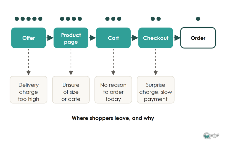
Once the offer is right, the next place orders slip away is between the product page and payment, where add-to-carts either become orders or don't. A shopper who adds to cart and doesn't buy has usually stalled on a question about the size, the delivery date or the total cost.
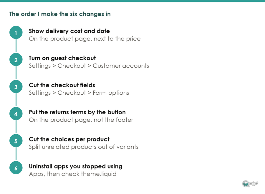
Read the emails and chat messages shoppers send before they buy and you'll find the same handful. The six changes below improve ecommerce conversion rate by answering those questions where the decision is made, in the order a shopper meets them.
Show Size And Fit The Way Shoppers Judge Them
Shoppers judge size from the photos first, so show the product next to something of known size or on a person with their height stated. Show sizes as buttons with sold-out sizes greyed out, and the shopper can see what's in stock before choosing.
Add a fit note in plain words ('runs small, so size up if you're between sizes') beside the size chart. A chart gives the measurements, and the note tells the shopper which way to go. A shopper in the Arndale, the big shopping centre in Manchester city centre, can try a pair of jeans on. Online the photo and the fit note are all they have.
Put A Delivery Date Beside The Add To Cart Button
A shopper who needs a present by Saturday can't do anything with '3-5 working days', because a range doesn't tell them whether it lands in time.
The post-purchase platform Narvar cites research showing that specific delivery dates lift conversion by 13 to 25% over vague ranges. That lift depends on the shopper believing the date, so show a date your courier meets every time.
Put 'delivered by Friday 2nd October' and the delivery cost beside the button. Work the date out from where your stock ships from and your courier's collection time.
Give Shoppers A True Reason To Order Today
Your new delivery date becomes a reason to order today once it carries its cutoff: 'order in the next 3 hours for delivery on Friday'. Christmas last order dates and the size of a limited run work the same way, because each one changes what the shopper gets if they wait.
A single line of text can do this job as well as a clock can. In Clean Commit's review of published timer tests, one sentence about next-day delivery for orders placed before 4pm lifted revenue 27.1% for Bob & Lush, a UK dog food brand.
Tie urgency to real cutoffs like delivery dates, and keep it apart from discount codes. A sitewide code every other week teaches shoppers to wait for the next one, so keep sitewide sales to a couple of genuine events a year.
Skip the cart timer that says the basket expires in ten minutes. On Shopify that claim is false, because stock is only held at the final stages of checkout. A countdown to a real delivery cutoff or sale end is fine.
A false deadline is also a misleading practice under UK consumer law, and our guide to urgency and scarcity marketing covers which cues hold up.
Get The First Five Reviews Onto Every Product
A product's first handful of reviews does most of the persuading, and each one after that adds less. List the products with fewer than five reviews and ask their recent buyers first. Where the reviews sit on the page matters too, and our guide to social proof on product pages covers where to put them.
Leave the critical reviews visible. A rating a little under five stars, with some complaints showing, is easier for a first-time buyer to believe.
Show Every Unavoidable Charge Before Checkout
A delivery charge that first appears at checkout reverses a decision the shopper had already made. In the UK, an unavoidable charge held back until checkout is also a legal problem.
Since 6th April 2025 the Digital Markets, Competition and Consumers Act has required the first price a shopper sees to include every unavoidable charge. The Competition and Markets Authority's first fine under the Act, set out in TLT's briefing, was £4.2 million against AA Driving School and BSM for a £3 booking fee revealed at checkout.
Where delivery is optional or varies by address, state on the product page how it's worked out. Our guide to the ecommerce checkout process covers which checkout settings Shopify lets you change.
Put Express Payment Above The Form Fields
Typing a card number and an address on a phone is the slowest step in the whole purchase, and most Shopify orders are now placed on a phone. Turn on Shop Pay, Apple Pay and Google Pay, then check the buttons show at the top of checkout and in the cart.
Where the buttons sit matters too. In Stripe's payment-method experiment, conversion doubled when Apple Pay was shown earlier in checkout instead of at the end.
A checkout that loads slowly on a phone loses the order before the form is even filled in. If yours drags, speed up your Shopify store before you work on the other checkout changes.
Some shoppers will still leave at this step, so check that Shopify's abandoned checkout email is switched on to send them their basket.
Judge Each Change On Revenue Per Visitor
A good conversion rate for your store is one that brings in more revenue per visitor than it did before the change, on the same kind of traffic. Conversion rate alone can mislead you: it can rise on a cheaper basket while revenue falls, and it tends to drop when cold ad traffic joins your search visitors.
So whatever you change to improve ecommerce conversion rate, compare revenue per visitor over the four weeks before and after, with search and ad visitors kept apart. Our guide to ecommerce conversion rate benchmarks covers typical rates by sector.
Between 21st and 23rd September 2026 Shopify changed how it counts sessions, so your Shopify conversion rate can move across that week without a single order changing. If it jumped or dropped then, check orders before you credit or blame anything you changed.
For when a change is big enough to split-test, see our ecommerce A/B testing guide.
Find Out Which Pages Lose You Orders From Search
Search visitors arrive wanting the product, so these changes pay back first on the pages they land on.
Our SEO audit ranks those product and collection pages by the organic revenue they're leaking, with the fixes in the order to make them. If you get your SEO audit, I'll show you which of the pages your search visitors land on are losing orders, and the first change to make on each.

About the author
John Butterworth
John Butterworth is the founder of Mint SEO, a Manchester ecommerce SEO agency he started in 2024. He has 11 years in SEO and digital marketing, previously running SEO departments for market-leading brands and several agencies. He specialises in Shopify and ecommerce SEO, and his work has ranked over 100 websites and driven more than 3 million organic visits. He speaks at industry events including the SEO Mastery Summit.
Connect on LinkedIn →