
Knowledge Hub
How To Audit Your Conversion Rate Without Chasing A Fake Leak
By John Butterworth · September 29, 2026
An ecommerce CRO audit finds the one step in a store's funnel where shoppers stop buying, and the reason they stop there. It starts from the orders that never came and works back through the funnel. Every check has a pass condition. Its checks cover the funnel first and Shopify's own reports second, then move to the product page and the checkout. At the end you hold the failed checks and the page to fix first.
Sometimes the number behind a falling rate is wrong, because a change in how a report counts visits can move the rate while orders stay flat. Rebuilding a product page will not fix that.
So when a month-on-month fall in conversion rate lands on my desk, the numbers come first. The order below is how I, John Butterworth, work through it. I run a Shopify SEO agency in Manchester, and a page I get ranking earns nothing if its visitors leave without buying.
Run The Checks In Order From Missing Orders Back To One Page
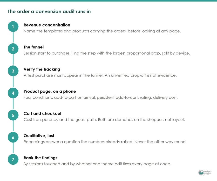
An ecommerce CRO audit runs in a fixed order of checks. Each audit check has a pass condition, and the audit moves on only when a check passes.
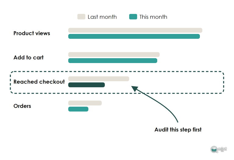
- 1. Audit the funnel rates for the last 30 days against the 30 days before them, with both windows on the same side of Shopify's September 2026 session change; it passes once you have named the one step whose conversion rate moved.
- 2. Audit that stage by device and traffic source; it passes when the drop shows in every one of them.
- 3. Date the drop and list what changed on the site that day; it passes once you can name the change or confirm there was none.
- 4. Put the Shopify reports behind that stage through the next section's checks; it passes when every row of that table passes.
- 5. Watch session recordings of that stage sorted by rage clicks, then audit the page against its table of checks below until every row passes.
As founder I run these five checks myself on every store I work with. On a Shopify store they take an afternoon, and I run them again whenever a rate moves month on month, so each change that follows is a data-led decision.
Read Each Funnel Conversion Rate Against Last Month
Use the store's own last month as the baseline for every rate in the audit. Rates across the whole market move with the season and the ad market, so another store's benchmark cannot tell you which of your audit checks failed. Write each rate and its baseline into the audit record before moving on.
A benchmark helps later, to size the shortfall once the audit has found it.
Split The Rate By Device And Source Before Blaming A Page
A large share of the sessions in your reports are not shoppers. In its bot report published in April 2026, Imperva found that during 2025 automated traffic made up more than 53% of all web visits, against 51% a year earlier.
Bots land in the session count and never buy, so a conversion rate can fall in the audit with no page at fault. Shopify's Sessions by device type and Sessions by referrer reports split the visits for the dates of the drop. The channel split that separates a traffic problem from a page problem is set out in the post on reading your ecommerce funnel.
The Day The Rate Fell Tells You What Broke
A sudden drop has a date. Open the daily view of the step that moved, find the day it fell, then list what changed on the site that day.
It's usually an app install or a theme update, and sometimes a new delivery rate.
Shopify's theme library shows when each theme was last saved, which dates a theme change for you.
Rule Out A False Drop Before You Audit A Page
This check stops an ecommerce CRO audit from chasing a conversion rate drop that isn't real. In a conversion audit on Shopify, two reports cause most false alarms: the abandoned checkout list, and the session count under every conversion rate. Before the audit moves on to a page, the drop in your weakest funnel step has to survive both.
For the audit, GA4 never matching Shopify to the order is expected.
That check passes when the difference between GA4 and Shopify orders holds steady week to week. Pixels pasted into the old order status page have gone quiet since Shopify's changelog confirmed script tags no longer run there, and the full set-up is in the post on conversion tracking.
Shopify Only Logs An Abandoned Checkout Once An Email Is Typed
For a CRO audit, the abandoned checkout list is the report most likely to mislead. Shopify records an abandoned checkout only after the shopper types an email address or phone number.
A shopper who reaches checkout, sees the total and leaves before that field never appears in the list. Nor does a shopper who opens an express wallet from the cart and closes it without paying, because the wallet only passes their details to the store once they pay.
On Shopify's one-page checkout the order summary and total sit on the same screen as the email field. A shopper put off by the total can leave without typing anything, and leaves no trace.
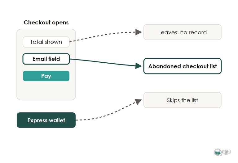
Read reached checkout against orders in Shopify analytics for the true exit count, using the same dates for both numbers. Then watch recordings of the first screen of checkout, where those silent exits happen.
Shopify Rebuilt Its Session Numbers In September 2026
Shopify changed how its analytics measure sessions in a rollout that ran from 21st to 23rd September 2026, which the analytics team at Ask Bosco flagged for UK stores that week. It changed the number your conversion rate is divided by, and the rate can move while orders stay flat.
The post on your ecommerce conversion rate sets out what moved in the counting and how to read a rate from either side of that week.
Answer Every Buying Question Before The Buy Button
On the product page, an ecommerce CRO audit checks one thing: can a shopper answer every question that decides the purchase before they reach the add to cart button. Shoppers who can't find a detail on it tend to leave.
Reviews do two jobs on a product page. They answer the trust question for a first-time visitor, and they add text to the page that no other store carries.
Ask for a review by email once the order has arrived, and show photo reviews first, because a customer's photo answers the fit question as well.
Delivery Cost And Returns Sit Beside The Button
A policy page two clicks away does nothing at the moment a shopper decides, so delivery cost and returns belong on the product page itself. This is the row I see fail most often on the stores I review. On most Shopify themes the fix is a text block under the price in the theme editor, and it rarely needs a developer.
Shoppers also compare delivery charges between stores before they buy, and a delivery price that looks high next to a rival's loses the sale on this page.
Give Shoppers A True Reason To Buy Today
A shopper with no reason to buy today puts it off, and most never come back to finish. I'm a big fan of urgency for that reason, as long as the reason is real. An order-by time for next-day delivery works well because it is true every day and resets on its own.
Keep it true. The CMA treats countdown timers that imply an offer ends when a comparable offer carries on as misleading, and a stock message has to match real stock. A low-stock line drawn from your live inventory count meets that test, while a fixed number typed into the theme does not.
Test Where Your Checkout Loses Conversions
The last check in an ecommerce CRO audit covers the step where conversion is closest to done: the checkout. When the funnel read puts the drop between reached checkout and orders, the audit starts with a real order. Log out of your admin, open the store on your phone and buy something cheap with each payment method, from the cart page to the confirmation.
A checkout that fails to load from the cart on one phone shows up in no conversion report. That is why the test order is the first row of the checkout audit.
What Shopify lets you change inside its checkout is set out in our post on the checkout process. What matters to the audit is which row failed and what fixes it.
A Cost That First Appears At Checkout Is Now A Legal Risk
Mandatory fees other than delivery are the next checkout row in the audit, because a booking fee or small-order charge that first appears in checkout costs conversions. In the UK it also breaks consumer law.
The CMA's first fine under its new direct powers, announced on 15th April 2026, was over a £3 booking fee that two driving schools left out of a headline price. It carried a £4.2 million penalty plus refunds, as Jones Day's summary of the case sets out. Card surcharges fall under that same check, since every cost a shopper must pay belongs in the price they see before checkout.
Put Express Payment Buttons Where A Phone Sees Them First
A missing express option is one of the conversion killers I see most on phones, and a checkout without one fails this row of the audit. In its 2026 Global Payments Report, Worldpay puts digital wallets at 40% of UK e-commerce value already, heading for 50% by 2030.
Express checkout with Apple Pay or Shop Pay lets a phone shopper finish without typing a card number, and the long card form is where phone checkouts lose people. Google's wallet belongs beside them.
Check Whether Your Search Visitors Came Ready To Spend
When the split in the second check puts the drop on visitors from Google, the page is often fine and the searches are wrong. A store that ranks for searches people make while still comparing options gets readers who were never going to spend that day.
On a store with this problem, my work starts with the search queries that bring sessions which never reach the cart. Changing which searches the store ranks for, and which page each one lands on, is how organic revenue grows from searches that end in orders.
That ranking check can come first if you'd rather hand it over: get a free SEO audit of your store.
Book a free 30-minute consultation and bring your funnel numbers. I'll go through them with you: the searches behind sessions that never convert, and the first pages I'd fix.

About the author
John Butterworth
John Butterworth is the founder of Mint SEO, a Manchester ecommerce SEO agency he started in 2024. He has 11 years in SEO and digital marketing, previously running SEO departments for market-leading brands and several agencies. He specialises in Shopify and ecommerce SEO, and his work has ranked over 100 websites and driven more than 3 million organic visits. He speaks at industry events including the SEO Mastery Summit.
Connect on LinkedIn →