
Knowledge Hub
Ecommerce Web Design That Sells, Ranks And Survives A Relaunch
By John Butterworth · September 23, 2026
Every page template on your store has one job to do for a shopper. Good ecommerce web design makes sure each template does that job on a phone as well as a desktop. A homepage routes shoppers into your categories. A collection page helps them narrow the choice, and a product page settles their last doubts beside the buy button.
Those same templates also decide what Google can read on every page. I've spent more than 11 years in SEO, and the stores I audit after a new theme goes live often look sharper while the headings, links and copy that Google relied on have moved or gone.
This guide takes each template in turn on live UK store pages from Lakeland, Oliver Bonas and Cox & Cox. After that come the design decisions that change your rankings and a safe way to put a new design live.
Give Every Page Template One Job Shoppers Need Done
Four templates carry most of the work in ecommerce web design: the homepage, the broad category page, the collection page and the product page. Each is shown below on a live UK store.
The Homepage Routes Shoppers Into Categories, Even On A Phone
A homepage earns its first screen by routing shoppers into your categories and your search. Shoppers who start on your homepage are usually looking for a range, and one offer only serves the few who came for it. Lakeland's homepage keeps doing this while a sale is running: its search box is the widest element in the header and nine department links sit directly under it.
Its seasonal hero carries three category tiles for Cleaning Electricals, Blue Bakeware and Food Prep beside a single Shop offers button, so a shopper who ignores the sale can still pick a category.
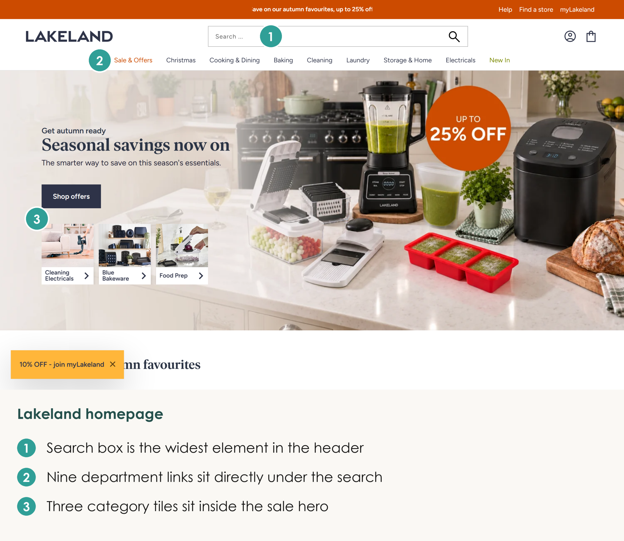
On a phone that department bar folds away behind a menu icon. Lakeland keeps the three category tiles directly under the offer, so a shopper can still reach a category without opening the menu. Before I sign off a homepage design, I check it on a desktop and on a 390-pixel phone screen and make sure a category is one tap from the first screen. Our guide to designing a store for mobile shoppers covers the rest of the phone layout.
A Broad Category Page Works As A Hub Of Subcategories
When a top-level category covers a wide range, design it as a hub that hands shoppers on to narrower subcategories before it shows a single product. You can see this on the Homeware page at Oliver Bonas. Under its heading and a strip of delivery terms it shows large image tiles for Home Furnishings, Lighting, Tableware and Mirrors in place of a product grid.
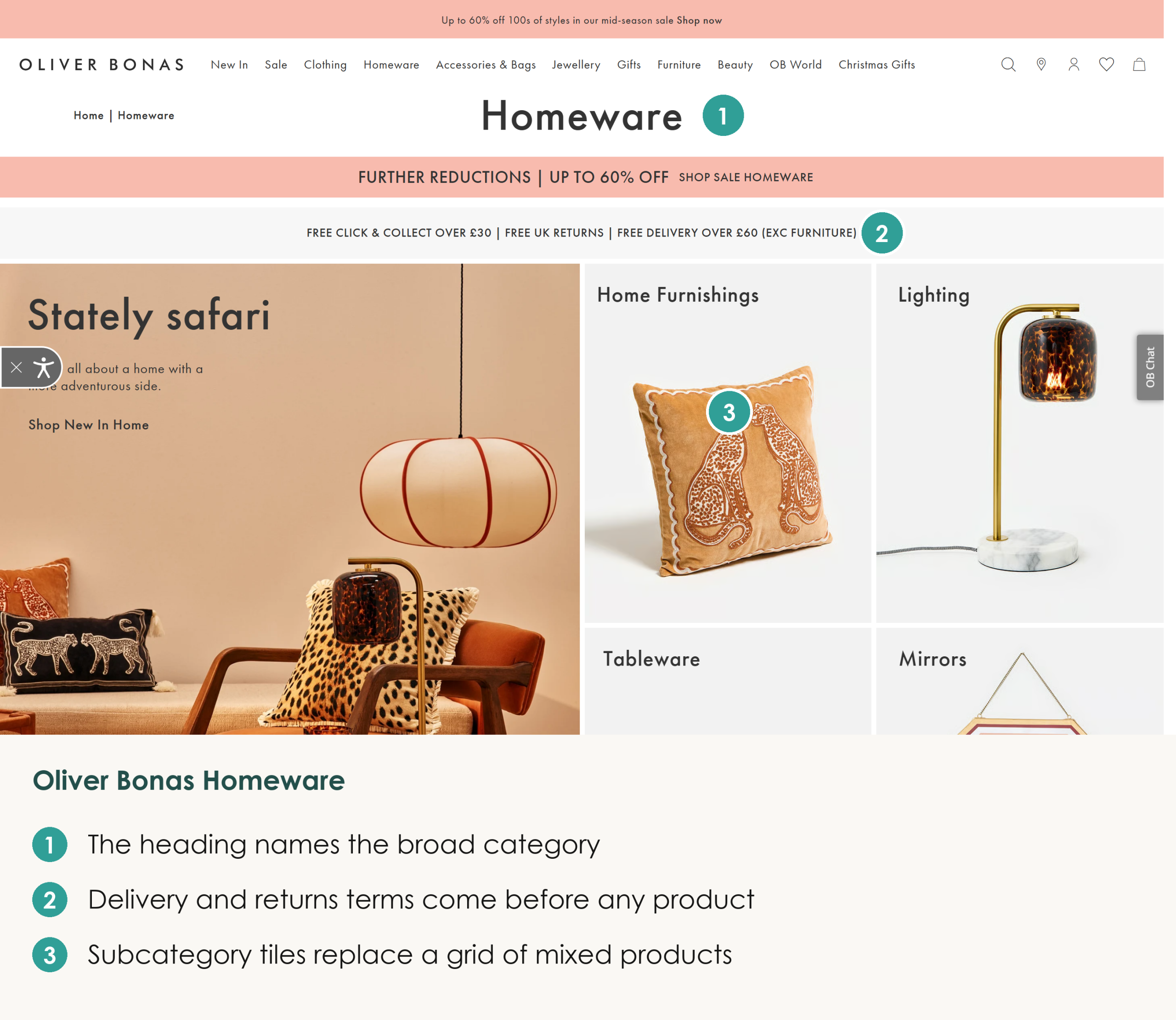
Those tiles matter because a grid of hundreds of unrelated products makes the shopper do the sorting. Plenty of stores still hide their subcategories in a filter panel instead of making them the main content of the page. One tap on a tile does the sorting for the shopper and helps keep every product within three clicks of the homepage, which is the depth I plan for on every store structure we design.
A Collection Page Puts Filters Above The Grid And Copy Below It
A collection page should open with a one-line intro and filters that show product counts. Its products belong on the first screen and its fuller copy belongs below the grid. The Lighting collection at Cox & Cox gets the top of the page right, with one line under its heading and a Read more link so the grid starts straight away.
On that Cox & Cox collection the filter bar runs across the top of the grid. Each product-type option shows how many lamps sit behind it, with 109 table lamps and 80 pendants. Counts let a shopper see which filter is worth tapping before they tap it, so fewer shoppers land on a near-empty result.
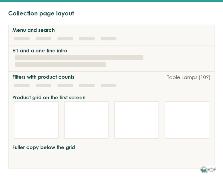
Once the shopper has narrowed the set, the copy below the grid explains what belongs in the set and who each option suits. That copy helps shoppers choose, and it gives Google the words it needs to rank the page. Keeping it under the products means the grid still leads on a phone.
Put Stock, Delivery And Returns Next To The Buy Button
Put stock, delivery time and returns right beside the buy button, and keep that button within reach on a phone. Cox & Cox's page for its Arlene Table Lamp shows In Stock and a delivery window of two to five working days directly above Add to Basket. Its returns policy sits in a tab further down, and that's the one line I'd move up next to the delivery promise.
Wrong or conflicting detail on the product page loses sales and brings items back. In Salsify's consumer research, 54% of shoppers said they had dropped a purchase over conflicting product information. And 71% had sent an item back because its description was inaccurate.
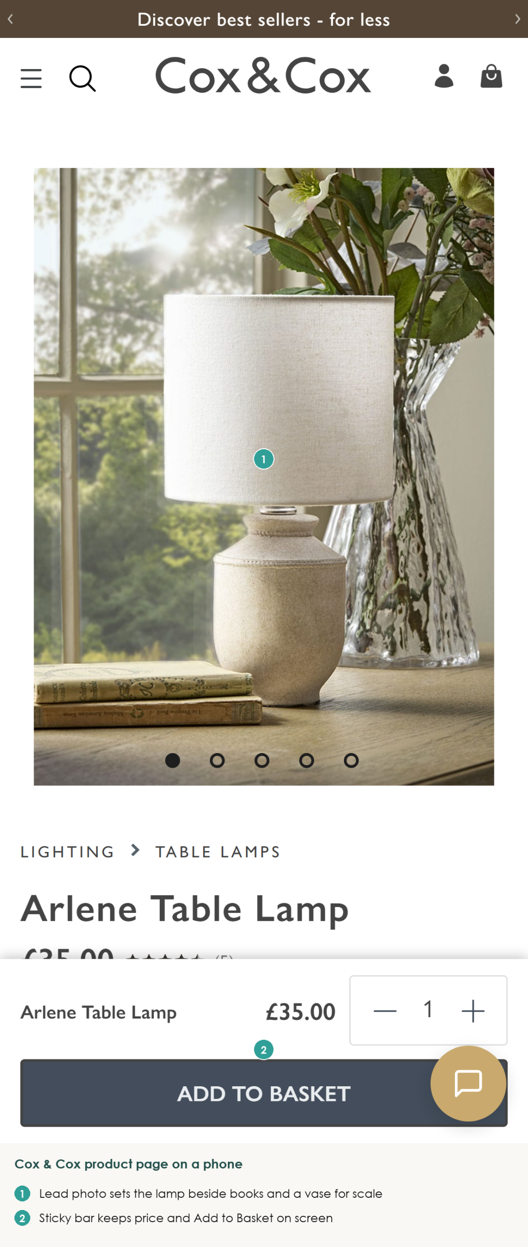
Keeping the buy button in reach matters most on a phone, where the same page pins a bar to the bottom of the screen with the product name, the price and a full-width Add to Basket button. Nothing about buying scrolls out of view while the shopper looks through the photos. Phones still convert far worse than desktops: Contentsquare's 2026 mobile benchmarks put desktop conversion at 3.4%, which is 74% higher than mobile web.
Product Photos Need One Shot That Shows Scale
Every product gallery needs at least one photo that shows the product beside things a shopper already knows the size of. Cox & Cox leads its Arlene lamp gallery with the lamp lit on a sideboard next to a stack of books and a vase of flowers. Its height reads at a glance, and the cut-out shots of the shade and base sit in the thumbnails.
A cut-out on a white background gives no sense of scale. So the shopper guesses, and a wrong guess comes back as a return. Your gallery also does work in search, because Google's product results on a phone show product images and review stars prominently.
Design Decisions That Change What Your Store Ranks For
Most of what Google reads on a store page comes from your theme's templates. Three decisions in ecommerce web design change what Google can read on every page. All three belong in the design brief before launch, because fixing them once the theme is live means paying for the same template work twice.
Your Theme Writes The Headings Google Reads
A theme's templates decide which text on a page becomes its headings, and Google leans on those headings to understand what the page is about. A template that wraps the logo or a promo banner in the H1 pushes the product name down the page's structure, and one that prints two H1s leaves Google two competing main headings. When a designer hands over a new theme, I check the heading order on one product page and one collection page first.
Open one of your product pages, view the source and search for the opening H1 tag. You want exactly one, wrapped around the product title. If the store name or a banner slide sits inside an H1 as well, the fault is in the template, so every product page on the store carries it until the theme is fixed. If you're still picking a theme, our guide to choosing a Shopify theme for SEO covers what to check before you buy.
Keep Cart Code And App Scripts From Pushing Content Down
One of the mistakes I see most often on store audits is cart code placed above all of the page content. A slide-out basket and its app scripts load first and push the intro and the product grid down. Google then reads a page that opens on code rather than on what the page sells.
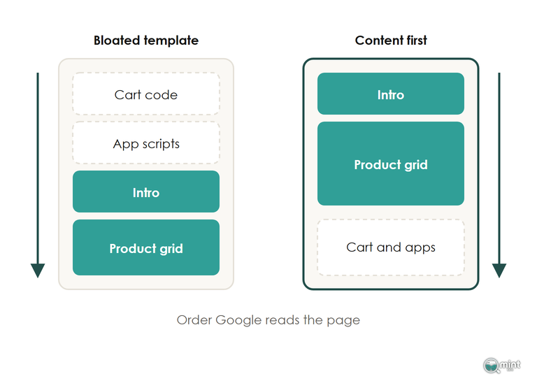
To see what loads ahead of your content, open a collection page's source and read what sits between the opening body tag and your H1. Cart drawers, review widgets and chat apps each add code there. Moving each one below the product grid, or removing the ones you no longer use, brings the intro and products closer to the top of what Google reads. Our builds treat this as a launch requirement, with lean code, optimised assets and zero bloat.
Speed is worth fixing mainly because slow pages lose sales, and the ranking effect is small next to the orders that go with them. Those Contentsquare benchmarks also found that just under 11% of sessions still wait more than three seconds for a page. Product pages carry around a third of all visits in that data, so a slow product template affects the most shoppers.
Menus And Filters Have To Be Links Google Can Follow
Google finds a store's categories and products by following links from the homepage and the menus, which means every menu item has to be a real link to a real page. Some themes and app-built mega menus only draw their items after a shopper hovers or clicks. To check yours, run a category page through Screaming Frog and confirm each menu item appears as a plain link to its URL.
Some filters swap the products with a script without giving the filtered view an address of its own. A shopper sees no difference, but Google has no link to follow to those filtered views.
Filters are the harder call, because only the filter combinations people search for should become pages Google indexes. I set out how to decide which ones in our guide to which filter pages Google should index.
Launch A New Ecommerce Web Design Without Losing Sales Or Rankings
A redesign replaces the look and layout of every page on your store at once, from the homepage to the product page. Launched properly, any dip after a new design goes live is short and recovers within weeks. When a new look loses sales for months, the store usually skipped one of three steps. It didn't record what the old design earned, test the new one against it, or check the new pages in the first week.
Record What Each Page Of The Old Design Earns First
Before the designer hands over the new design, write down what each page of the old one earns. List the pages that bring in the most revenue and the searches each one ranks for. Then note what the design of each page does: its headings, copy, links and where the buy button sits. The new layout has to keep the parts of those pages that earned the sales.
That list also lets you judge the new design after launch. Without it a normal dip and a real loss look identical, and owners end up rolling back a design that was fine.
Test The New Design Against The Live One Before Switching
Run the new design as a split test before it replaces the old one. Show it to a share of visitors while the rest see the current version, and compare the two on orders.
Test the big change, which is the whole design, and let it run for at least a full week of trading before you judge it. Early swings in a split test say very little, so orders over the whole period are the number to trust. The new design goes live only if it sold more over that period, so the switch is a data-led decision.
Check Redirects, Tracking And Product Markup In The First Week
In the first week after launch, check the four things a theme swap breaks most often:
- Redirects: if the redesign changes any URLs (renamed collections or a move to a new platform), redirect every old URL to its new one on launch day. Then crawl the old list to catch anything that errors.
- Tracking and checkout: place a test order and confirm it reaches your analytics, because a theme swap can break tags and the purchase path without any warning.
- Product markup: look for new structured data errors in Google Search Console, since a new theme can drop the markup that puts review stars in search results.
- Copy and cut pages: make sure the old design's copy is still on the page. Any page cut in the redesign needs a redirect so links pointing to it still count.
Each is far quicker to fix in the first week than after a month, and any one left in place can cost sales or hide what the new design is doing. If sales still fall after these checks, find the date they fell and what changed on the site that day, and rule out the technical causes before you blame a Google update.
Get A Store Designed To Sell And Rank
We design stores with the search side of ecommerce web design planned from the first template. Each store is designed to look good and built with the clean, fast code and heading structure that let it rank from launch day.
Our website design and development work covers new builds and redesigns, with the first-week checks above built into every go-live. Fixing product page H1s and copy was part of the work behind BedShelfie's 256% rise in Google Search sales, and I review every template we build before it goes live.
If you're planning a redesign or a new build, book a free 30-minute consultation and I'll tell you which of your current templates to protect and which to change.

About the author
John Butterworth
John Butterworth is the founder of Mint SEO, a Manchester ecommerce SEO agency he started in 2024. He has 11 years in SEO and digital marketing, previously running SEO departments for market-leading brands and several agencies. He specialises in Shopify and ecommerce SEO, and his work has ranked over 100 websites and driven more than 3 million organic visits. He speaks at industry events including the SEO Mastery Summit.
Connect on LinkedIn →