
Knowledge Hub
Your Shopify Product Page Has Two Buy Buttons. Only One Of Them Is Yours
By John Butterworth · August 17, 2026
Every guide to a Shopify call to action recommends the same four things:
- A contrasting colour
- An action verb
- A short label
- A test to prove it
That advice was written for a web page in general. Yours is a Shopify product page and it came with its buttons fitted, so the useful question is narrower.
Two questions decide it. Which buttons are yours to change, and which change is worth doing first? I run Mint SEO from Manchester and have spent eleven years on ecommerce stores where the product page carries the weight.
In the Shopify audits I run, the product page is where the largest single share of recoverable revenue usually sits. That holds across our clients' stores, because it is where the buying decision gets made.
I have opened the buy-buttons block of more Shopify themes than I can count, and the same two settings are wrong on most of them.
Below are the decisions the Shopify call to action on your product page gives you, ranked by what each is worth. Wording comes fourth.
The Four Calls To Action On A Shopify Product Page
Four buttons, not one. Your theme renders four buy buttons on a product page, not the single one you might picture.
Two of those four earn your attention this week. An accelerated checkout button changes the route every shopper takes. Add to cart is the second, and you own it outright, which is usually why nobody has looked at it since launch.
Quick add and the cart drawer matter less often. Quick add suits one-size consumables and gets in the way on anything with a size chart.
As for that drawer button, look at it while you are working on what you can change in your checkout, and not before.
The Second Button, And Whether It Stays
Shopify puts a second buy button on your product page. It reads Buy it now, the platform calls it an accelerated checkout button, and it competes with the button you spent your time thinking about.
Read how Shopify describes it and the framing gives the game away. Accelerated checkout buttons are an alternative to the Add to cart button for single products, its documentation says. Alternative is the word to sit with.
What The Accelerated Button Skips
Your cart page does real work on most stores. It announces the free-shipping threshold, holds the order notes field, and takes the second product. A shopper who presses Buy it now sees none of that.
Shopify is blunt about who it suits. Accelerated checkout buttons can only be used to buy a single variant of a product, and its own example is a shopper buying three aqua baking cups but not one aqua and one purple.
The trade therefore lands on your order pattern, and where an average order carries two lines that button serves an order you rarely take.
Here is the sentence I put in front of merchants who ask whether to leave it on. Shopify's own words: unless your online store receives many orders for one kind of product, then accelerated checkout buttons might not benefit your sales. The platform's own default comes with a condition attached, and that condition is a catalogue where people buy one thing at a time.
What The Accelerated Button Switches Off
Behaviour is one thing. What stops working is a set of cart features you may already depend on.
Accelerated checkout buttons don't support cart attributes, Shopify states plainly, and cart attributes are the custom fields you add to your cart page. Three examples it gives:
- Terms and conditions checkboxes
- Gift-wrapping options
- Delivery date pickers
Hold those against your own cart. If you collect a delivery date for a florist order or a gift message, a Buy it now order reaches you without either.
Whole categories of app go the same way. Shopify names currency converters, apps that interact with the cart, and apps that send customers to an external checkout. That last group bites hardest in practice.
A Shopify Partner posted on the company's community board that dynamic checkout buttons had stopped applying the line item properties their app was setting.
They also noted that the compatibility section made no mention of the limitation. They were reading the right page, and the behaviour sat outside what it described.
None of this makes the button wrong. It makes it a trade you can price.
Count last month's orders, noting how many carried more than one line and how many carried a cart attribute you rely on. Small numbers on both, keep the button. A large number on either, and you are buying speed with data you need.
Keeping It On Some Products And Not Others
Often the answer differs by product. Shopify has a route for that, though its setting is not where most people look.
From your Shopify admin, go to Online Store > Themes, then Edit theme next to the theme you want. From there:
- The Home page dropdown
- Products, then your template
- Product information
- Buy buttons
That checkbox reads Show accelerated checkout buttons. Older theme versions label it Dynamic checkout buttons instead.
Notice where the path ends. It ends at a template, and merchants trip over that distinction constantly.
If you want to display accelerated checkout buttons for some products but not for others, Shopify's answer is an alternate template. Duplicate the product template, switch the setting in one copy, then assign it.
For a mixed catalogue, that is the arrangement I aim for. Your consumable that people reorder singly keeps the fast route, and your made-to-order piece with a gift message keeps its cart.
Making Add To Cart The Heaviest Thing On The Page
Contrast comes next in the guides on a Shopify call to action. Almost none of them mention that your theme already made that decision.
What Dawn Does When You Switch The Second Button On
Dawn is the theme Shopify ships as its reference build, and its buy-buttons snippet is public. One line decides how Add to cart is styled.
In Dawn's buy-buttons.liquid, that submit element takes button–secondary when show_dynamic_checkout is true and button–primary when it is false.
Which means, in plain English: switch the accelerated button on and Add to cart drops from the primary style to the secondary one. Solid fill moves to the button that sends people off your store.
Nobody chose that. It came with the checkbox. Live stores show the result without any code reading:
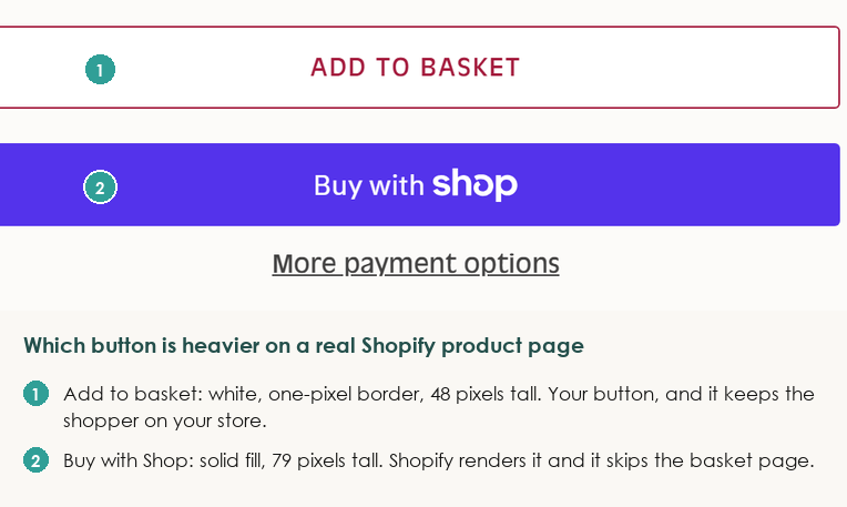
- On the Tiptree reduced sugar bundle: its Add to basket button renders on a white background with a one-pixel crimson border and stands 48 pixels tall. The Buy with Shop block below it is filled and stands 79 pixels tall.
- On the Komodo George gilet: its Add to cart button has a fully transparent background and a one-pixel orange outline at 44 pixels tall, sitting above an 81-pixel filled block.
- Represent goes the other way. Its Add to cart button is filled solid black at 52 pixels tall, with the additional checkout buttons block beneath it at 66.
That Tiptree product page, captured on 17th August 2026. The button keeping a shopper on the store is the lighter of the two.
That last one matters most. The hierarchy is a theme decision that somebody at Represent went and made.
Your fix, if you want it, is a theme style override on .product-form__submit.
The Styling You Cannot Reach
A ceiling applies here, and it is worth knowing before you brief a developer.
Shopify's developer reference is explicit about it. The accelerated checkout buttons hide their HTML in a custom element with a closed shadow DOM, so styling or event tracking aimed at that structure will not work.
What you get instead is a named set of CSS custom properties. Nothing more.
Nor is that a theoretical limit. Shopify's developer changelog warned on 16th August 2024 that existing customisations would break, with rollout to all merchants beginning 15th September 2024. Stores that had styled those buttons lost the work on a published date.
Two consequences follow, and both are worth planning around.
Branded buttons cannot be made to match your brand, because Shopify allows colour and font changes on the unbranded version only.
Click events cannot be attached either, which leaves your second button invisible to the analytics you use everywhere else. Anyone building conversion tracking they can trust wants to know that in advance.
What The Button Says In Each Of Its Three States
Wording is the fourth decision. It matters, it is the cheapest change on the page, and it is worth roughly a tenth of the two decisions above.
Where The Wording Lives
Your button label is not a product setting and it is not in the theme customiser. It is a theme content string.
Shopify's route to it runs through four clicks:
- Online Store
- Themes
- The button beside your theme
- Edit default theme content, then filter for the phrase you want
Both Add to cart and Sold out sit under the Products category there, which covers messages about viewing products and product availability.
One value, one theme, whole store. That is why the most common wording question on Shopify's community board has no clean answer.
A merchant asking how to change the Add to Cart label on one product type is looking for a setting that does not exist. Their route is the same alternate template as before, and it costs more than the change is usually worth.
What To Put There
Shopify's own suggestions for rewording are worth a look because of what they are not.
- Cart becomes Shopping bag or Basket
- Sold out becomes Unavailable
- A gourmet chocolate store changes Continue shopping to Continue indulging
Vocabulary matching, in other words. None of it is conversion copy. Your shopper reads this label at the moment they have already decided, so its job is to confirm what happens next.
One edit reliably backfires, and Shopify carries a warning about it. The unbranded version of the accelerated checkout button includes Buy it now text, so a matching label on your own button might confuse customers.
The reason is worth spelling out. Rename Add to cart to Buy Now with the second button on, and you have two near-identical labels doing entirely different jobs.
Urgency belongs in the surrounding page, where it has room to be believed. I have written separately about urgency and scarcity that holds up.
The Two Labels Underneath
Almost nobody edits the other two labels. Your theme holds three for this button and decides between them.
Those three are products.product.unavailable when no variant is selected, and products.product.sold_out when the variant is unavailable or a minimum-quantity rule blocks it. Otherwise it shows products.product.add_to_cart.
Two of those three render a disabled button, and sold out is the obvious one.
Unavailable catches people because it shows before a shopper has chosen a size. That is every product with variants, which on a clothing store means every product.
Someone who has just landed sees a dead grey button reading Unavailable. A proportion of them read that as out of stock and leave.
Two stores I looked at give the state a job.
- On the With Nothing Underneath blouse page, before a size is chosen the button reads SELECT A SIZE rather than a greyed-out Add to cart
- At Buck Mason, its product button reads SELECT SIZE TO ADD TO CART before a variant is picked. That names the missing input and the outcome it unlocks
Both replaced a dead state with an instruction, exactly where the shopper was already looking. Fifteen minutes in the theme content editor, applied to your whole catalogue at once.
For the effort it takes, that is the best-value change in this article.
One more condition looks like a bug and is not. Dawn disables the button when a minimum-quantity rule sits higher than the stock on hand, and the label it reaches for is Sold out.
Your product has stock, nobody can buy the required amount, and your shopper sees Sold out. You see an unexplained flat line.
The Button On A Phone
On a phone, where your traffic mostly is, a Shopify call to action stops being about persuasion and starts being about dimensions.
Those dimensions bite in two places. A label that reads well on a desktop mock-up wraps to two lines at 390 pixels wide, or collides with the quantity selector. Merchants report that on Shopify's community board far more often than they report anything about wording.
Load your own product page on a real handset before deciding what the button says. Two checks take a minute each: the label should hold one line at 390 pixels wide, and the whole button should be reachable with a thumb.
Sticky Add to cart bars are the second question, sold everywhere as the fix for a button that scrolls away. I am more careful with them than most, because the evidence is thinner than the popularity suggests.
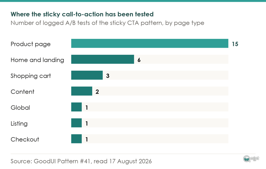
GoodUI has logged twenty-nine A/B tests of the pattern, run by named practitioners and each recorded with its visitor count, the most recent by Dave Volman on 13th August 2026. Pooled across all of them, the GoodUI repository publishes a running statistical-power figure: 88.9% of 90% cumulative power target at 1% MDE.
Twenty-nine tests, and it has still not settled the question at a one per cent effect. Read that as an argument against expecting a sticky bar to move your quarter, or to earn permanent screen space.
What the log does suggest is that the interesting variable is which element stays stuck, and Volman's own experiment ran two floating elements against a variation floating only the bottom one.
Build the conditional version, where the bar shows only once the real button has scrolled away. One is worth the screen space when it carries the variant already selected and appears late.
For the wider order of work on small screens, the six mobile changes that move ecommerce revenue first puts that button in its place.
Testing A Button Change Without Fooling Yourself
Testing comes last. Here is what testing takes, because for most Shopify stores the honest answer is that they cannot.
Sample sizes in the published work show why. Test # 657 on Obsbygg.no by Joachim Furuseth, logged in the GoodUI record for June 2026, ran to 1,238,014 visitors.
One test, one pattern, one site. A button change moves a small percentage of a small percentage, so telling it apart from ordinary weekly noise needs an enormous sample. A store on a few hundred sessions a week reads only weather.
Divide the changes on this page into decisions and guesses.
What remains for testing on a Shopify call to action is genuinely small. It wants add-to-cart rate as its measure, because that is the step the button is responsible for.
Where you do have the traffic, your traffic decides which A/B tests you can run sets out what each level of volume can answer.
And where the numbers say you cannot test, keep improving the page anyway. Make changes you can defend on their merits, then watch the trend.
Where Mint SEO Fits
Six decisions on one page is a lot to hold. Which matters most depends on things a general article cannot see: your catalogue, your order pattern, your theme. The second button is the one I would look at with you first.
At Mint SEO we treat that button as part of a system. It sits downstream of the searches a product page is built to win, and upstream of what the checkout does next.
That system is what I would bring to your page. Book a free 30-minute consultation and you get me, the founder, for half an hour.
That half hour opens your product page, looks at what your theme has decided for you, and picks the two changes worth making this month. Straight answers, no jargon.
Book your call, and bring the product page you are least sure about.

About the author
John Butterworth
John Butterworth is the founder of Mint SEO, a Manchester ecommerce SEO agency he started in 2024. He has 11 years in SEO and digital marketing, previously running SEO departments for market-leading brands and several agencies. He specialises in Shopify and ecommerce SEO, and his work has ranked over 100 websites and driven more than 3 million organic visits. He speaks at industry events including the SEO Mastery Summit.
Connect on LinkedIn →