
Knowledge Hub
Ecommerce User Experience: Give Every Page on Your Store One Clear Job
By John Butterworth · September 29, 2026
Your store gets visits and too few of them become orders. Good ecommerce UX means a shopper gets from the page they land on to a paid order without a moment's doubt about the product, the price or what to tap next. In practice, each page type has to do one job well, and nothing on a page can contradict itself.
Mint SEO is my agency, and my name is John Butterworth. Store owners send me search traffic that isn't turning into sales, and before anyone talks about a new theme I want to know which page shoppers are leaving from, because putting one page right costs a fraction of a redesign.
Good Ecommerce UX Gives Every Page One Job
The simplest test of a store's UX design is whether each page type does one job.
Most of the UX problems I see come from a page trying to do two jobs in one layout.
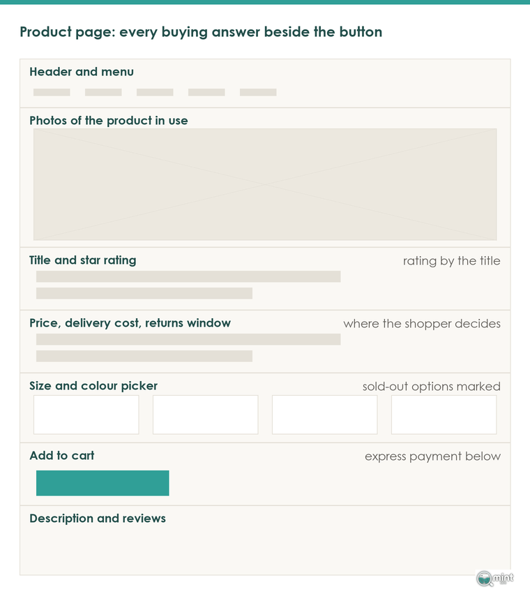
On the homepage that job is a line on what you sell and a route to the bestsellers. A collection page needs a product count and the styles people shop by above the grid, a product page answers the buying questions beside the price, and the cart shows the total with delivery and gets out of the way.
The Homepage Steers Shoppers To What Sells
Someone landing on your homepage from an ad or a search result has never heard of you, so the first screen has two questions to settle: what you sell, and why they should believe you. After that its only job is getting them to the products that sell.
Where the user experience goes wrong is a homepage of ten sections that each try to make a different sale, a banner for one product line, a promotion for another and a brand story in between.
Keep the sections that answer a new visitor's first doubt, because someone who doesn't know you still needs enough on the page to believe you. Then move the bestsellers up. Make those changes one section at a time, and the sessions with cart additions in Shopify's conversion report will tell you which one worked.
The Category Page Narrows The Range Before The Grid
A category page does its job when a shopper can see what the range holds and narrow it before they scroll.
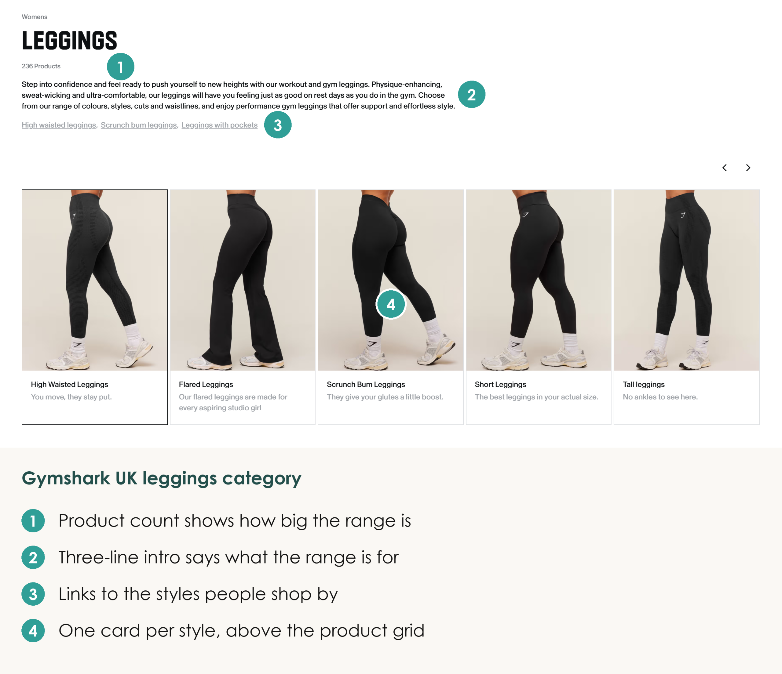
For a clean example, look at Gymshark's women's leggings category: a product count (236), a three-line introduction that names what the range is for, and links and cards for the styles people shop by, all above the product grid.
That same short introduction is what tells Google what the page is about, which is why it has to load before any heavy code sits above it.
I see stores put cart and app code above the page content, so a shopper waits on a blank space and a crawler reads scripts before it reads a word.
Speed is worth fixing mainly because slow stores lose sales, and every app adds scripts and slows the store. Switch apps off in turn and retest Interaction to Next Paint, then work through our guide to speeding up a Shopify store.
Our guide to category page copy covers what goes above and below the grid.
After that, open Shopify's report of top online store searches, because the terms people type into your search box are the products and words your menu isn't giving them.
Put Delivery And Returns Beside The Product Price
On the product page, the shopper decides at the price.
Put the delivery cost and the returns window right next to it.
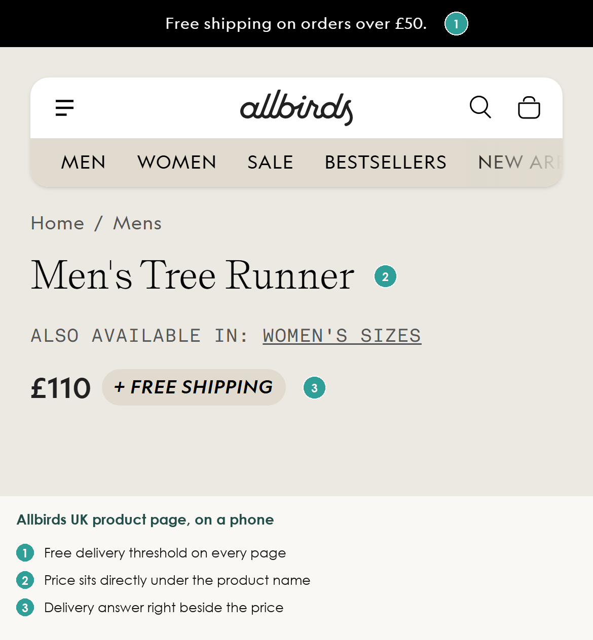
Allbirds does this on its Men's Tree Runner page: on a phone, the £110 price carries a "free shipping" badge beside it, and the £50 threshold sits in the bar at the top of the page. That placement matters because the shopper knows the delivery cost before they scroll.
Leaving that answer to a policy page two clicks away costs the sale. When Syndigo surveyed shoppers for its State of Product Experience 2026, 83% said a page missing the detail they need will probably send them to a competitor. That's a buyer you already paid to bring to the page.
Reviews and a full description now weigh more with shoppers than a discount does, so put the rating by the title and real photos of the product in use where the decision is made.
Compare your top landing pages in Shopify Analytics with the sizes and colours you have sold out, to see how much product page traffic lands on something it can't buy. Those visits never touch the funnel, and their drop-off hides in your bounce rate.
Once an item is in the cart, the same rule applies: no surprises. Show the total with delivery before the checkout button, add express payment buttons for people buying on a phone, and let anyone check out as a guest. Our post on the ecommerce checkout process takes the checkout step by step.
Read Your Own Store The Way A Stranger Would
Some of the worst ecommerce UX problems are in the copy, and a new design would carry them straight over. They are contradictions a stranger spots in seconds and an owner stops seeing: two prices on one product page, a review block still showing the theme's sample text, free delivery promised on the page and taken back in the cart.
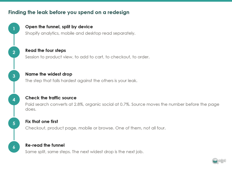
Good ecommerce UX work begins with reading your own store the way a shopper does, which takes ten minutes and no tool. Start with the page that loses the most phone shoppers compared with desktop, which our guide to finding the step that loses you customers shows how to spot.
Read The Failing Page Line By Line Every Month
A theme update or a new app is usually how a contradiction gets onto a live page, because nobody rereads the page afterwards.
Once a month, open that page as if you had never seen the store and read every line from the top, then read it again after every theme update or new app.
Recordings Show What A Stranger's Read Misses
Reading the page catches what it says, and session recordings catch what it does when someone taps it. Clarity is the free tool I'd point you to, and the first of its recording filters to open is quick backs: people who clicked through to a page and came straight back. When that keeps happening from one menu link or one collection, the page they landed on wasn't what the link had promised them.
Dead clicks show taps on things that look clickable and do nothing, and rage clicks show someone tapping the same spot again and again.
Excessive scrolling is the filter I'd check on product pages. Someone flicking down the page too fast to read any of it is hunting for something the page doesn't show near the top, such as the delivery cost, the size guide or the reviews.
Watch twenty recordings of the page you're fixing and you will usually see the same moment repeat, such as a size picker that doesn't respond or a sticky bar sitting over the price. Recording scripts add weight to every page, so run the tool for a week or two and take it off once you have your answer.
Test The Store On A Mid-Range Phone, Not The One In Your Pocket
Most orders are placed on a phone now, and over last year's US holiday season 56.4% of online transactions went through a smartphone. Your shoppers aren't all on this year's flagship, though, so test on a mid-range Android: check the add to cart button and size picker sit within thumb reach, then work through our mobile ecommerce guide.
When The Theme Is What Needs Rebuilding
Sometimes the recordings show the same fault on every product page, because it lives in the theme template and no single page fix will reach it. One edit to that template then fixes the ecommerce UX of every product page at once.
We're a Shopify SEO agency, and we also design and build themes. Our Shopify themes run on lean Liquid code with no page builders.
Every build comes with 365 days of support after it goes live. If the search side needs checking at the same time, our SEO audit covers it.
If you can't tell whether a low conversion rate comes from the theme or one page, book a free consultation with me and bring the page your analytics points at. You'll leave with clear answers and a few quick wins, whether we work together or not.

About the author
John Butterworth
John Butterworth is the founder of Mint SEO, a Manchester ecommerce SEO agency he started in 2024. He has 11 years in SEO and digital marketing, previously running SEO departments for market-leading brands and several agencies. He specialises in Shopify and ecommerce SEO, and his work has ranked over 100 websites and driven more than 3 million organic visits. He speaks at industry events including the SEO Mastery Summit.
Connect on LinkedIn →